Portfolio

UI/UX Design Case Study

Famous Dave's - Case Study

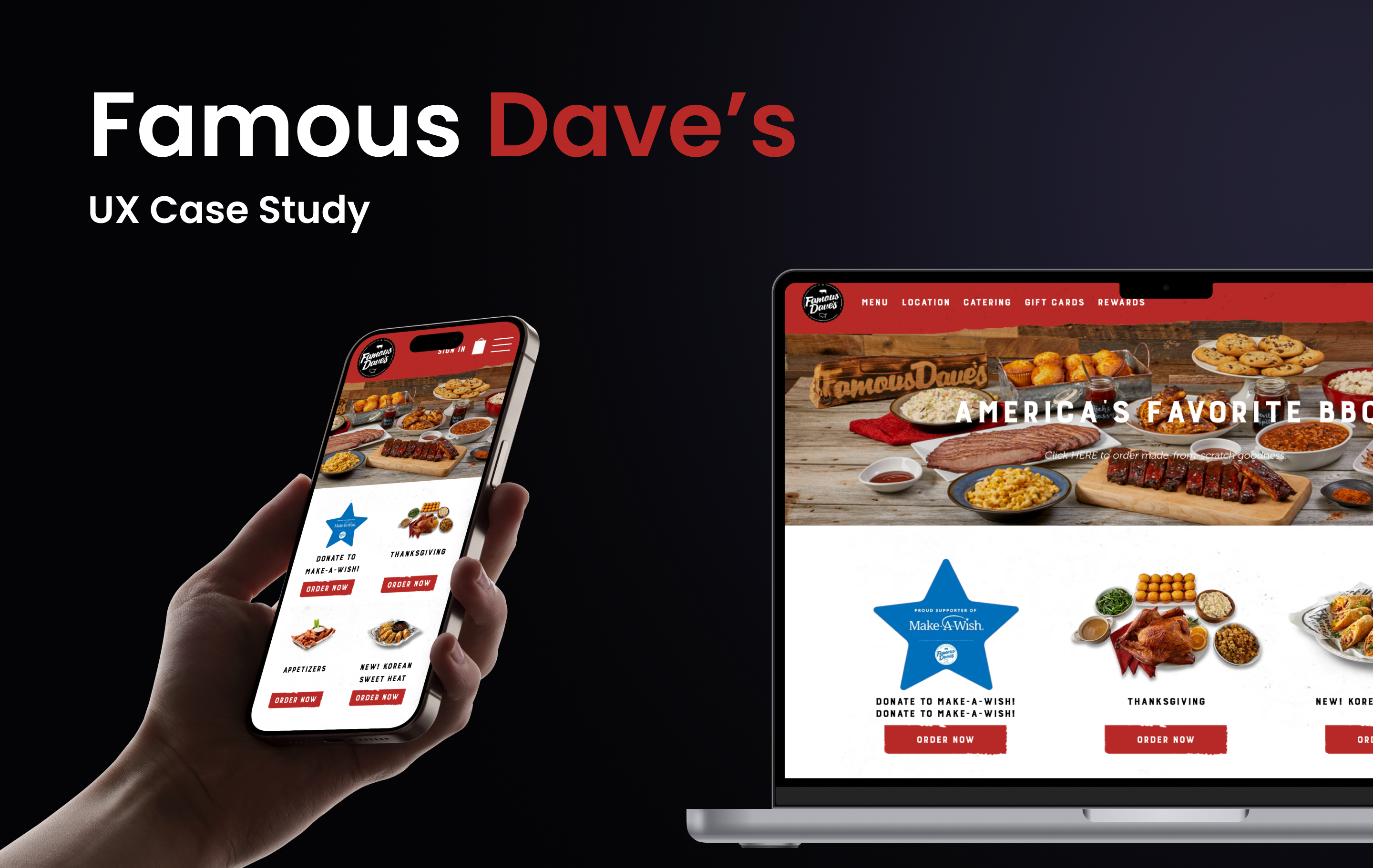
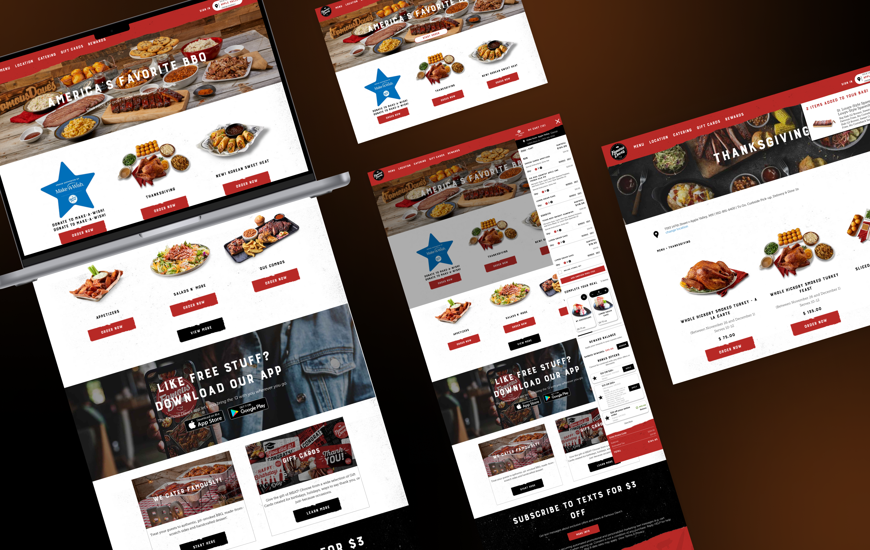
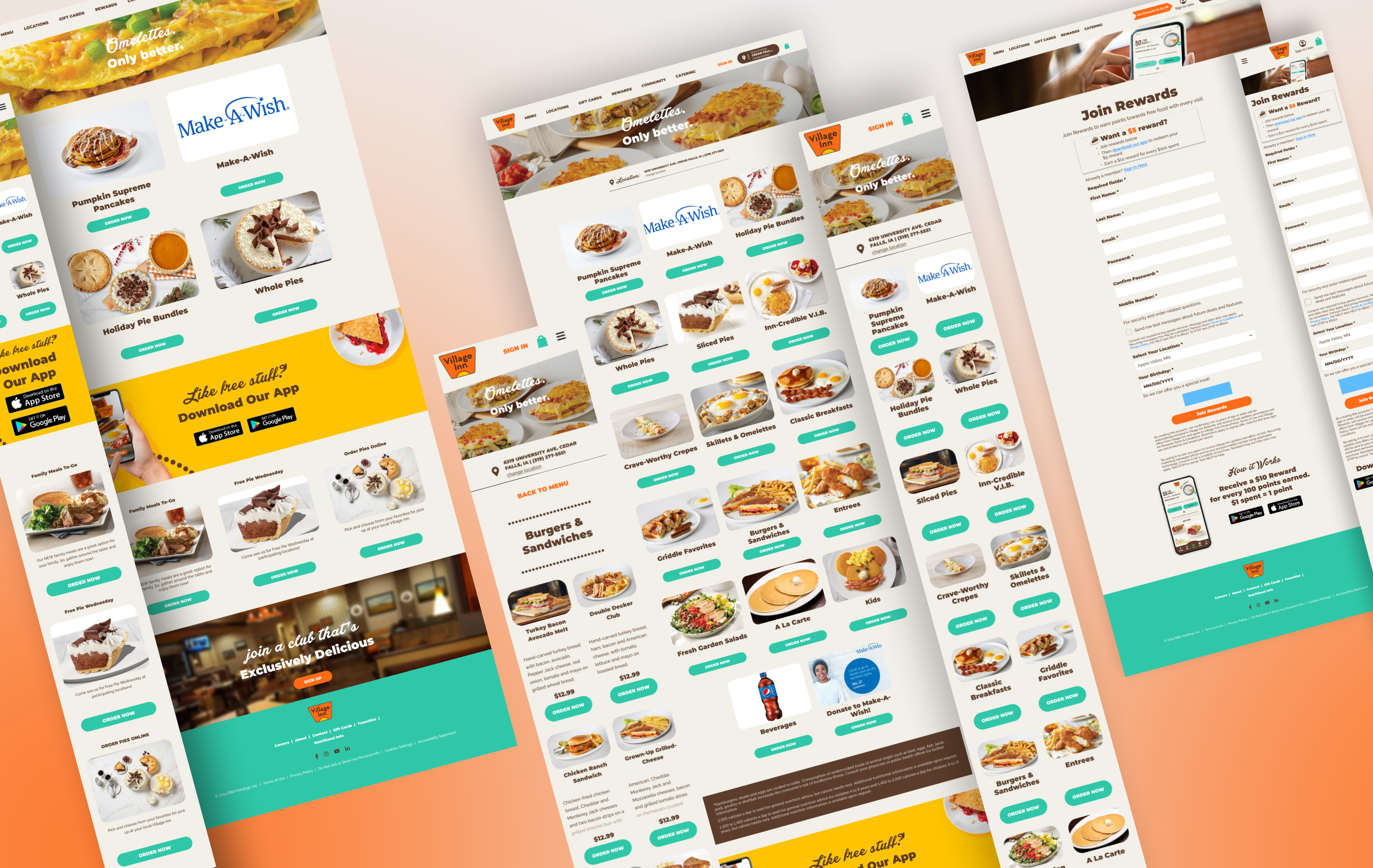
Famous Dave’s is a household name known for its smoky flavors, hearty meals, and authentic BBQ spirit — but their online experience didn’t reflect that same energy. The website felt outdated, cluttered, and hard to navigate, especially for users ordering on mobile. My goal was to bring the brand’s signature warmth and flavor into the digital space — crafting an online journey as satisfying as the food itself.
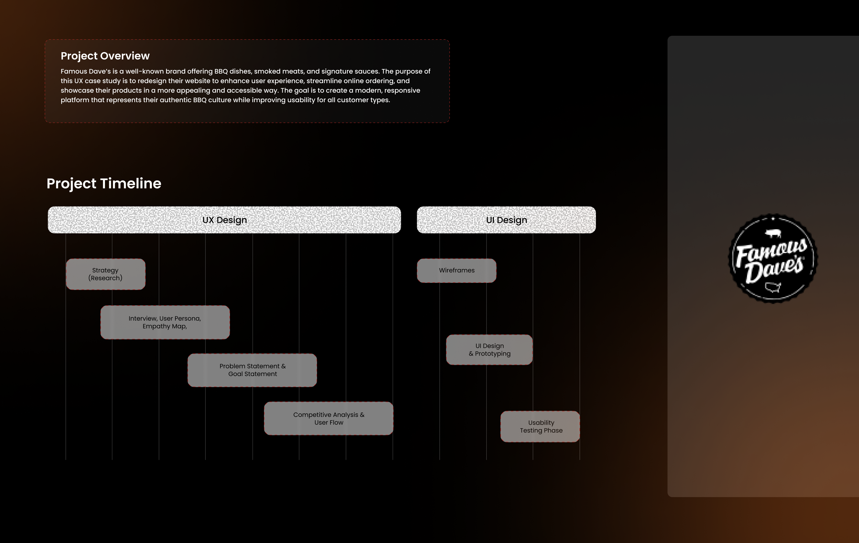
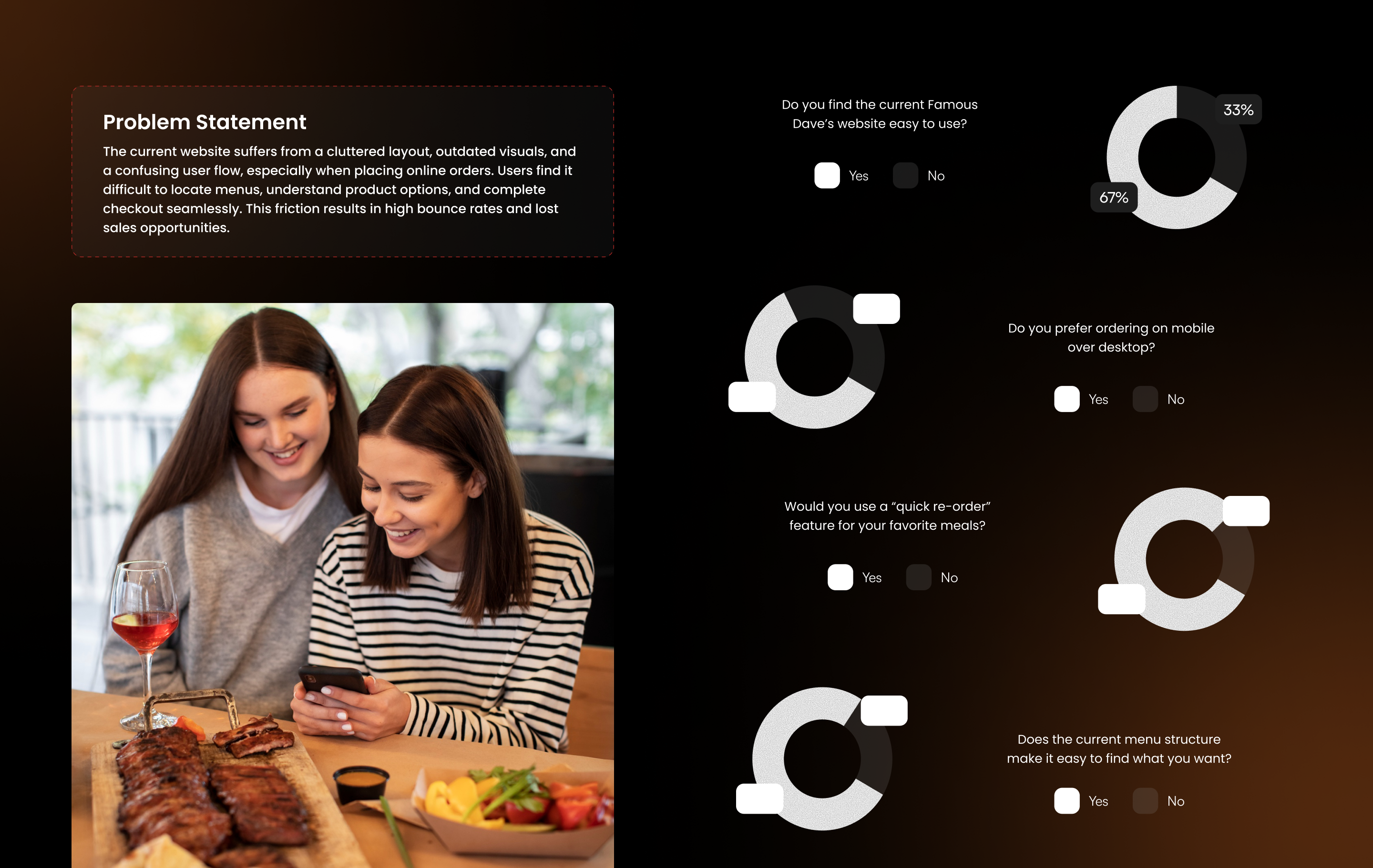
Through user interviews, surveys, and usability testing, I uncovered key frustrations such as hidden deals, confusing menu flows, and slow checkout experiences. The redesign focused on simplifying navigation, creating clear product categorization, and making the ordering process faster and more intuitive. I introduced a modern interface with bold visuals, a smarter rewards system, and an improved mobile layout that encourages quick reordering and personalization.
The result is a clean, mouthwatering digital experience that turns casual visitors into loyal customers. The new design captures the soul of Famous Dave’s — flavorful, bold, and customer-first. Every interaction feels effortless, every step feels guided, and every click takes users closer to that perfect plate of BBQ.

Village Inn - Case Study

Village Inn has long been a symbol of comfort, warmth, and family-friendly dining. But in a fast-changing world, traditional restaurants face new expectations: faster service, healthier choices, and engaging experiences that bring everyone together. My goal was to redesign the digital experience to make Village Inn feel as welcoming online as it does inside its restaurants — blending nostalgia with innovation.
Through extensive family interviews and usability research, we discovered key challenges: long wait times, limited dietary options, and a lack of digital engagement for kids and parents alike. Our solution introduced a refreshed website and mobile experience with smarter table management, real-time menu updates, and family-oriented features such as interactive play zones, kid-friendly activities, and customizable meals that fit every lifestyle.
The result is a warm, inviting digital ecosystem that connects families beyond the table. With its modern visuals, simplified navigation, and integrated rewards system, Village Inn now offers a dining experience that feels personal, efficient, and full of heart. Every detail — from the color palette to the interactive flow — reinforces one mission: making every family visit more enjoyable, from reservation to dessert.

Amsterdam Audit - Case Study

This case study explores my role in a comprehensive audit of Amsterdam Printing, a B2B website specializing in custom business promotional products tailored to every budget. With a notable increase in abandonment rates during the studio and checkout processes, our small but dedicated team was tasked with uncovering the root causes and providing actionable insights.
Through a rigorous heuristic evaluation and usability testing, we identified 39 critical and major issues across 9 distinct categories, along with 128 additional findings that were crucial to improving the user experience. Our findings not only guided the client’s next design phase but also resulted in significant business impact, with many high-priority items being added to the product roadmap.
By proactively addressing these issues, our audit saved the client an estimated $50,000, underscoring the value of strategic design and usability analysis in driving both user satisfaction and business efficiency.

Converge - Case Study

This case study focuses on a pivotal phase in the ongoing three-year redesign of the Converge B2B platform, a white-label site dedicated to providing mid-sized businesses with branded apparel, signage, and other essential materials.

The Converge website is undergoing a complete transformation aimed at modernizing the user experience and enhancing accessibility. As part of this extensive project, my colleague and I conducted a heuristic review and secondary research using insights from the Baymard Institute to tackle the early adoption of the Cart Page.

Our analysis revealed critical issues, including a combined Cart and Checkout page that resulted in a lengthy scroll and confusing navigation, a cluttered UI with excessive divider lines, and inconsistent iconography and text. While the broader project addresses all device sizes, this case study highlights our efforts to optimize the mobile experience, setting the foundation for a more intuitive and user-friendly platform.

Logo Design

Posters Design

Stationary and Street Ads Design

Contact